Wedding design
How to match photo booth strips to your wedding invitations
Your invitation introduces the wedding's visual style; a photo strip turns it into a keepsake. Choose which details travel well between formats rather than shrinking the entire stationery design.
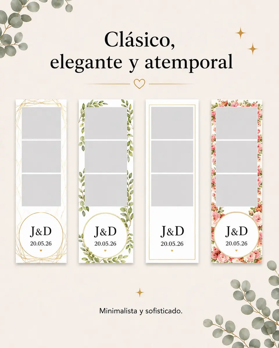
Graphic examples
Two ways to carry your visual identity
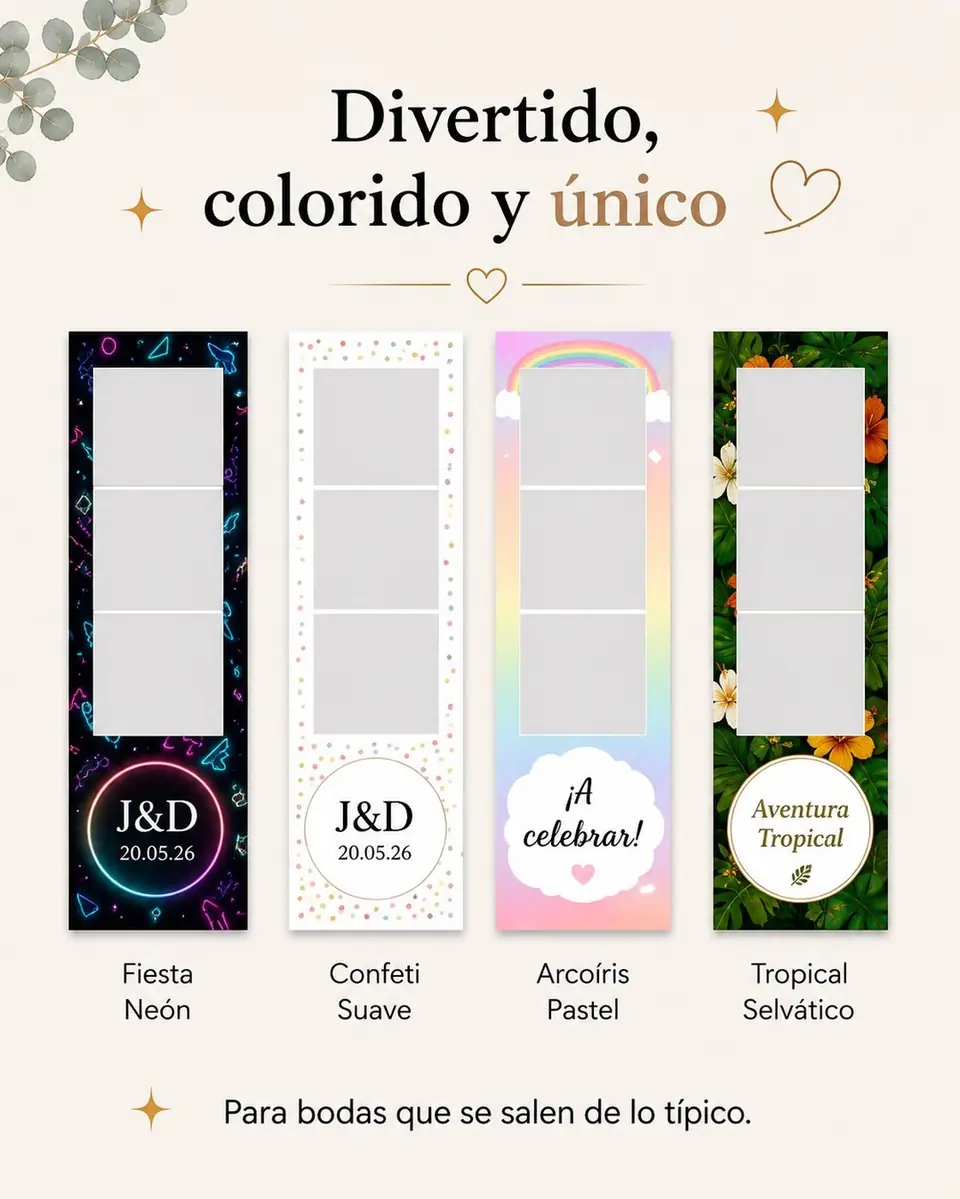
Choose three details to repeat
Start with a main colour, a type style and a recognisable motif: initials, a flower or a line. These can link the invitation and strip without adding the entire ceremony programme or venue map.
Cream paper, green leaves and dark initials can become a fine botanical border. With colourful invitations, concentrate stronger colour on the edge or name area instead of placing it across the photographs. These are composition suggestions, not approved client designs.
Adapt the layout to a narrow print
Photo strips are read in the hand. Text that works on a large card may become unclear when reduced. Prioritise names or initials and the date; keep decorative artwork outside the picture windows.
Use decorative lettering for a short accent and simpler type for information that needs quick reading. Thin strokes and low-contrast colours deserve particular attention in the preview.
Review the actual print format
An enlarged mobile preview cannot prove that small lettering will work on paper. Review the final dimensions and, where appropriate, a printed sample. Check the outside margin, space between pictures, date and logo placement.
The examples help choose a style. Picture count, measurements and personalisation options are confirmed for the chosen service, not inferred from an Instagram poster.
What to share for your design proposal
- An invitation or visual reference without unnecessary private information.
- Exact names or initials and date.
- Two or three colours and the motif to retain.
- A preference for subtle or colourful styling.
- One person responsible for approving the final composition.
The main idea
Repeat a few well-chosen details and check that photographs, names and date remain the focus.
Frequently asked questions
Must the strip copy the invitation exactly?
No. Adapt the main elements to the available space and readability of the print.
Can we reuse an invitation illustration?
Check the designer's permission and provide a suitable file. Having a reference image does not itself grant reproduction rights.